Since the SEMIA project started last year we have had several research meetings between the involved project partners and are gradually developing work routines. We have also organized two workshops involving the different user groups we work with – artists, heritage partners and media scholars – in order to determine the user requirements for the software and interface(s) we aim to develop. We will post more about these events and the outcomes on the blog later.
In this first longer post on our research blog, I will offer an overview and some introductory remarks on examples of current visualization formats for moving image data in film and media studies and their intersection with media art. With this overview I hope to offer insights into the starting point for the SEMIA project while emphasizing the project’s urgency. This overview is in no way intended to be comprehensive (admittedly, it focuses mostly on examples from film studies). Yet, on the other hand, as not a lot of work is currently being done in this field, it can be considered fairly extensive, and I have tried to include a few examples that are not often part of the conversation on moving image data visualization.
An important focus of the SEMIA project is to nurture artistic reuse and exploration of archival moving image collections, using, specifically, data extracted from parts of both EYE Filmmuseum’s and the Netherlands Institute for Sound and Vision’s collections as a basis for visualization and interface navigation. In order to do this, EYE Filmmuseum has made primarily silent film material available to us – in large part from the Jean Desmet Collection – while the Netherlands Institute for Sound and Vision has chosen NOS news broadcast footage dating from the 2000s. How exactly we will analyze this data and allow for exploration of it are aspects which we have sought to determine in a dialogue between artists and scholars in the workshops mentioned above. In this process, our ambition has been to bring together groups – media historians, heritage professsionals, computer scientists and artists – which seldom discuss artistic, exploratory approaches to archival moving image collections at a cross-section between artistic and scientific practices.
Before we began this conversation and started the project, there were however several examples we were inspired by and whose work we build on, which I would like to point to in this overview. I have divided this overview into three sections; respectively Stylometric analysis of films and data visualization, Exploratory Data Analysis of Films and Artistic Data Visualization, discussing what characterizes each below while detailing some of the ways in which they inform the SEMIA project.
Stylometric analysis of films and data visualization
The emergence of film data visualization in media studies is closely intertwined with the development of stylometric analysis of moving images, or – as it is commonly referred to in film studies – statistical style analysis or cinemetrics. The methods associated with such approaches tend to answer specific research questions empirically and in a deductive fashion to determine the characteristic stylistic features of films, for instance to solve issues of authorship attribution or to date films, by creating statistical profiles of directorial styles, entire periods or genres.
SEMIA is working towards aims that are fundamentally different than traditional stylometric research. The aim of our project is not to do for instance authorship attribution or to study genres and periods, but rather to visualize patterns within moving image collections that may lead to serendipitous discoveries of similarities in different image features, for instance colour, shape and movement. Yet, we are inspired by traditional stylometric research to the extent that it has experimented with visualizing film data and given shape to it in various types of graphical representations in different – often quite inventive – ways, bridging the fields of media studies, quantitative data analysis and visualization.
Statistical approaches to film analysis have existed for almost a century and primarily center around montage and cutting rates as the central features of their analysis. Psychologist Hugo Münsterberg’s The Photoplay: A Psychological Study (D. Appleton and Company, 1916), which endorsed the practice of measuring the cutting rates of films as a basis for comparative film analysis and for understanding the psychological impact of film upon spectators is often referred to as a beginning point. Along similar lines the article “Bildschnitt” (1926) by German film historian Georg Otto Stindt for the journal Die Filmtechnik has been considered an early, pioneering effort in formalizing the systematic study of film’s cutting rates.
Since film studies became an increasingly institutionalized field of research in the 1960s and 1970s, stylometric research practices have slowly flourished and become gradually more refined. In Germany, especially the work of Herbert Birett – German geophysicist turned silent film scholar – from the 1970s onwards stands as one of the most rigorous attempts at developing formalized, scientific procedures for studying the development of film style. Birett’s work was in its time quite unique within film studies because it drew on advanced approaches in computational and quantitative linguistics at an interdisciplinary junction seldom explored in these years. Aspiring to analyze and discern patterns in films in a similar way as in language systems it reflected the quantitative methods of literary computing, as a way to date films and do authorship attribution.
More widely known from this period is the work of Barry Salt, whose classic 1974-article “Statistical Style Analysis of Motion Pictures” published in Film Quarterly is foundational to statistical style analysis. The article presented a general critique of film historiography up till then, which it argued lacked a solid empirical basis and critiqued it for making arbitrary judgements with regard to the discernment of stylistic developments and styles of directors. Instead, it suggested that scholars should count and measure shots – and later also shot types and camera movements – to create a stronger empirical fundament for their observations. Salt’s work has contributed to film studies by propagating especially the calculation of Average Shot Lengths (ASLs) – that is: counting all the shots and shot lengths of a film and calculating their average length – as the key parameter for comparing films.
Building on the theory and practice of Barry Salt’s research, the database and community of the web-based Cinemetrics project – initiated by film historian Yuri Tsivian at the University of Chicago – is perhaps the foremost site for the continued development of statistical style analysis today. The database counts info on approximately 19000 titles, consisting of a very hetegenerous corpus of film titles, television shows and for instance trailer and music videos. Beyond this, Cinemetrics has also hosted important discussions around key concepts of statistical style analysis, debating for instance the different advantages of calculating Average Shot Length versus Median Shot Length in the production of statistical data (a discussion which I will not detail here, but which is nicely introduced by Yuri Tsivian here), thus refining the epistemological foundations of stylometric research.
So, how may visualizations of such moving image data look like?
Style analysts and cinemetricians have experimented with a great variety of standard graphical representations for film data available in both open source and proprietary visualization software such as Matplot, Matplotlib, ImageJ and R, as well as with custom-made forms of visualization.
The image below shows the custom-made Cinemetrics-graph which Yuri Tsivian made for Charlie Chaplin’s City Lights (1931). For a full view of the graph in relation to its associated data and remarks by Yuri Tsivian see here. This is a good example of a very frequently used format which visualizes film data in a reduced, abstract graphical representation.
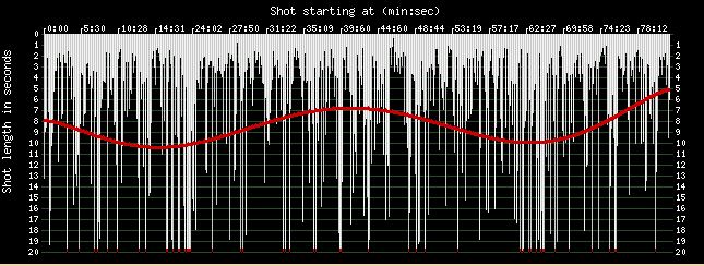
Yuri Tsivian’s Cinemetrics-graph of Charlie Chaplin’s City Lights (1931)
Cinemetrics scholar Mike Baxter has taken such work in different directions, exploring especially the potential of the open source software R, for making differently styled graphs. Baxter’s extensive work in this area can be explored in his book-length study Notes on Cinemetrics (2014) which is available here.
Exploratory Data Analysis of Films
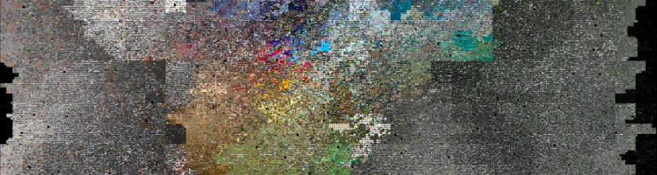
Other scholars who have worked extensively with cinemetric approaches have taken visualization of film data in different directions working not only with visualizing film statistics but also with frames extracted from digitised films (sometimes entire films), using the open source medical imaging software ImageJ. Especially media scholar Lev Manovich has explored this software as part of his Cultural Analytics framework, which among many other things aims to visualize patterns in big data image sets – for instance digitised heritage collections or Instagram images. ImageJ was applied in the Digital Formalism project in collaboration with Lev Manovich. In this project, film scholar and archivist Adelheid Heftberger meticulously annotated the shots in a corpus of Dziga Vertov films using the open source software Anvil making it possible to visualize structures in them using different kinds of scientific, visual analytics (in addition to ImageJ also MatLab was tested). The results have circulated widely and are often brought up when scholars point to the exciting avenues which the digital humanities may open for media studies. The visualization below shows an ImageJ montage visualization – this is what the visualization type is named in the software – which puts together a frame from each shot in Dziga Vertov’s Odinnadtsatyy (The Eleventh Year, Soviet Union, 1928) as a way to discern changes between shots.
ImageJ montage visualization of Dziga Vertov’s Odinnadtsatyy (The Eleventh Year, Soviet Union, 1928)
ImageJ allows for making many different visualization types in addition to the montage visualizations, for instance also so-called summary visualizations which scholars have used to find average colour values by layering film frames onto each other (for instance a sample of every x number of frames of a film or all frames from a film). This visualization type has been used to a great extent by media scholar Kevin L. Ferguson in the US to study patterns in genre films – for instance westerns or gialli – or by film scholar Miklos Kiss in the Netherlands. The example below is Ferguson’s ImageJ sum visualization of Sergio Leone’s Once Upon a Time in the West (Italy/US/Spain, 1968).

ImageJ sum visualization of Sergio Leone’s Once Upon a Time in the West (Italy/US/Spain, 1968)
In a previous project based at the University of Amsterdam – Data-driven Film History: A Demonstrator of EYE’s Jean Desmet Collection (2014-2015) – we also experimented with both ImageJ montage and summary visualizations for visualizing colour patterns in films from the EYE Filmmuseum’s Jean Desmet Collection. The results can be viewed here.
These latter examples build on stylometric research which it regards as a hermeneutical antecedent but also presents its visualization work as a form of exploratory research. For instance, Lev Manovich has cited John Tukey’s Exploratory Data Analysis (EDA) as an interesting reference point for visualization work in the humanities, which allows media scholars to use visualizations in a descriptive manner as a basis for generating new questions about the corpora they analyze, rather than regarding them as firm, scientific evidence. Such an attitude may also be said to resonate in Ferguson’s work who, rather than considering his visualizations evidentiary uses them for supporting film theoretical reflection on composition, space and volume. In this respect Ferguson, in particular, has been very clear about situating his work at intersection of media research and artistic visualization. As he writes in his article “The Slices of Cinema: Digital Surrealism as Research Strategy” (2016, p. 279):
“While not always drawn together, there is a tradition of experimental work such as mine that balances between both new media art and digital humanities scholarship.”
It is this intersection which SEMIA also explores, by trying to develop new approaches – for instance using deep learning methods (as will be discussed in upcoming blog posts). In our ambition to explore this intersection we have been inspired by various artistic visualizing practices, while we will not be applying the exact same approaches. Below, I discuss a few illustrative examples.
Artistic Data Visualization
In addition to stylometrics’ visualization formats there exists a small group of art works – media scholar Kevin Ferguson has even referred to these works as forming a “mini-canon” of data art works – which intersect and inform visualization practices in media studies. While working with different coding languages and visualisation software, the results produced are sometimes remarkably similar to what media scholars have produced with ImageJ in recent years and tend to explore especially the summary and montage visualisations as visual tropes of data-driven analysis. Strikingly, several of these works precede what media scholars are currently doing, some of them being made 10-15 years before media scholars began taking up similar methods. In SEMIA the aim is not to replicate the formats of such works, but – among other things through data visualization – to encourage artists to create new ones which may boost this small field of artistic production in new ways.
A series of early works which fall into this category is San Francisco-based artist Jim Campbell’s Illuminated Average Series. Initiated in 2000, the series includes a few film data visualizations, for instance of Alfred Hitchcock’s Psycho (USA, 1960) – see below – and a scene from Orson Welles’ Citizen Kane (USA, 1941) – which resemble the ImageJ summary visualization type a great deal. Campbell has exhibited these images in several museums in luminous display boxes which allows visitors to contemplate them and discover beautiful details in them.
Jim Campbell’s Illuminated Average Series: Alfred Hitchock’s Psycho (2000)
Media scholar and artist Jason Salavon’s work has also deployed a broad range of visualization types in order to explore patterns in various media types and genres, spanning from film data to music videos to Playboy magazines. For instance, Salavon has made visualizations and video installations on the most succesful films at the box office in his The Top 25 Grossing Films of All Time-works. The single-channel video installation version of this work The Top 25 Grossing Films of All Time, 2×2 (2001) – of which an excerpt can be viewed below – presents colour patterns in blockbuster films in a dynamic visualization of over-sized pixels. In the companion piece The Top Grossing Film of All Time, 1×1 (2000) – made a year earlier – Salavon presented a grid reminiscent of a montage visualization of the top grossing film at that time – James Cameron’s Titanic (1997) – in which each field represents a predominant colour in one of the films serving as source material. An impression of this work can be viewed here. Salavon’s works invite critical reflection on the formal characteristics and cultural conventions of mainstream culture, offering a view on the material they process which may engender critical perspectives.
Jason Salavon’s The Top Grossing Film of All Time, 1×1 (2000)
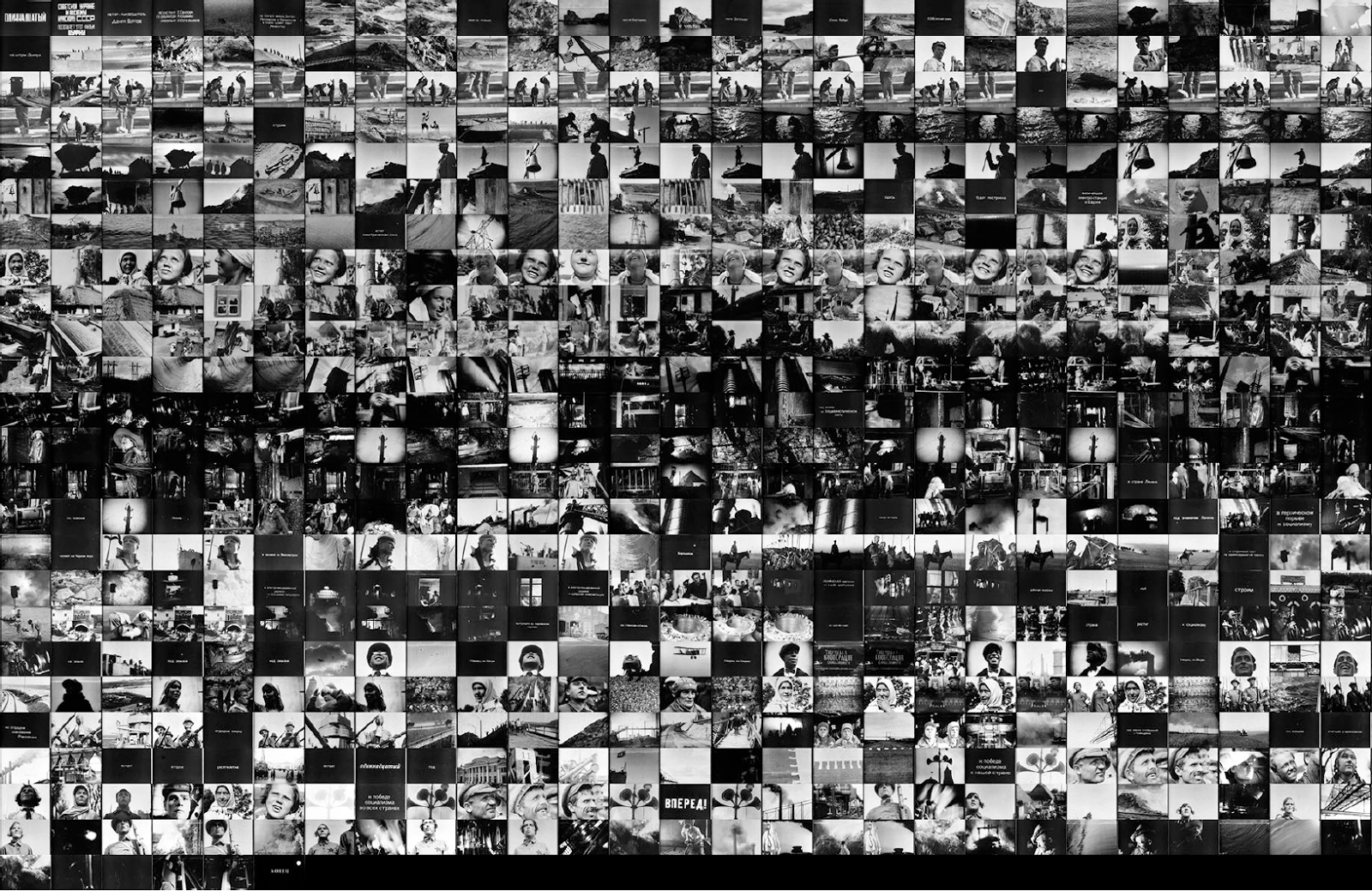
Another early example is the Cinema Redux project of British artist and designer Brendan Dawes created in 2004. As the subtitle and blurb of the project – both available on Dawes’ website – make clear, the purpose of the project was that of “Creating a visual fingerprint of a movie” which shows: “…a single visual distillation of an entire movie; each row represents one minute of film time, comprised of 60 frames, each taken at one second intervals”. Dawes did this by presenting wall-sized prints of montage visualizations which have been exhibited in numerous museums and media art exhibitions, first in 2008 in the MoMA’s Design and the Elastic Mind exhibition. Dawes work may be seen as being quite close to the fingerprinting which is a strong component of stylometric research but also invites us to contemplate data visualization’s beauty by exhibiting them in a gallery setting rather then using them as the basis for scholarly hypothesis testing.
Finally, one may also expand this reference frame with a few examples which are not often mentioned. For instance, one may consider a few works by Netherlands-based media theorist and artist Florian Cramer as belonging to this category. Concerned with making films for and transferring films to floppy discs – using a disc format allowing for a maximum capacity of 1.44 MB – the Floppy Films project explored, among other things, the aesthetics produced from compressing feature-length films which were nominated for an Oscar in 2009 – for instance Slumdog Millionaire (Danny Boyle, UK/France/USA, 2009), The Wrestler (Darren Aronofsky, USA/France, 2008). A description of this project written by Florian Cramer can be read here, and some of the resulting videos can be viewed here. One may consider these works in the lineage of a tradition of experimental film and video which investigate the material transition of films between different carriers to highlight – among other things – diferent media specificities.
In addition, I would also like to highlight the inventive and highly intriguing work being done by New Zealand-based silent film scholar and audiovisual preservationist Katherine Nagels. A silent film enthusiast, Nagels has written scripts with which she creates colourful rainbows of silent films – below an example showing the rainbow of Die schwarze Kugel oder Die geheimnisvollen Schwestern (The Black Ball; or, The Mysterious Sisters, Germany, 1913) – as a way to explore the colour palettes of silent cinema. Nagels has written a blog post on her work which can be found here.

Katherine Nagels’ rainbow visualization of Die schwarze Kugel oder Die geheimnisvollen Schwestern (The Black Ball; or, The Mysterious Sisters, Germany, 1913)
Data Extraction and Visualization in The Sensory Moving Image Archive
With this post I have given a few examples of the scholarly and artistic work which has preceded SEMIA in the field of film data visualization and which in different ways has offered a starting point for us. In our own work, we will however be taking things in quite a different direction, by working with new methods and approaches which have not yet been applied to archival moving image material – for instance deep learning. Our project’s focus is also quite different from previous work in that we wish to explore different image features than the ones discussed above, while nurturing artistic approaches to a greater degree, by facilitating a greater degree of serendipity and exploration. In the past few months we have had extensive discussions about this in our team and with a great number of scholars, artists and heritage professionals both in the Netherlands and abroad. Stay tuned for more details in the upcoming posts here on the blog!
– Christian Olesen
References
Birett, Herbert. 1988. “Alte Filme: Filmalter und Filmstil.” Diskurs Film: Münchner Beiträge zur Filmphilologie, no. 2 : 69-87.
Ferguson, Kevin L. 2016. “The Slices of Cinema: Digital Surrealism as Research Strategy.” In The Arclight Guidebook to Media History and Digital Humanities, ed. by Charles R. Acland and Eric Hoyt, 270-299. Sussex: REFRAME Books.
Nagels, Katherine. 2017. “A Rainbow of Silent Film” (blog post). Silents, Please! 21 August. https://silentsplease.wordpress.com/2017/08/21/a-rainbow-of-silent-film/.
Tsivian, Yuri et al. [N.d.] Measurement Theory. “Articles.” Cinemetrics. http://cinemetrics.lv/articles.php.
